Have you noticed that every smartphone, laptop, PC, and even application nowadays has a ‘dark mode’ or ‘dark theme’ option? Many of us like to keep the dark theme as our preferred setting across all the devices that we use. What do you think the reason is?
Well, it’s because dark mode design offers a brilliant aesthetic and visual comfort. On top of that, in some cases, the dark theme enhances accessibility for the users. Apart from that, it also helps save battery life and improves readability by cutting off excess screen glare.
However, from a designer’s POV, integrating a dark UI design is far more challenging than it seems! So, let’s follow this blog till the end and find out how a designer can make sure to integrate a dark UI design effectively.
Supposedly, you’re using any device like a smartphone, or laptop, or are browsing through an application or a website. And you find a setting named “night mode”, “dark mode” on your device, and tap on it.
The moment you do that, you’ll see a sudden change in the display of your device. Which was previously a light background with black buttons and icons, will just get interchanged with a black background and light buttons!
So, it is simply a display setting that helps switch your app’s or device’s default colour scheme. This color shift substantially changes the overall display aesthetics and makes it look a lot more elegant.
But, is the dark mode really just for aesthetics? Or does it fetch any additional benefits? Let’s take a closer look.
Dark mode emits much less light than its other counterpart! Hence, you can enjoy a more gentle and less strenuous viewing experience. Added to that, a lot of users say that dark mode is way better than the default light mode!
If you’re in a dimly-lit place, like your bedroom just after you wake up, looking at your phone to see the time can be a nightmare! The sudden contrast of the bright screen with the dimmed environment can be painful to your eyes. Dark mode helps cut off this excessive screen glare and makes it much more soothing for you.
People with color blindness or visual impairments might find it difficult to use their devices on apps in light mode. But the same users feel comfortable when using a dark UI background!
A pure black (#000000) background and a pure white (#FFFFFF) text should feel like a tempting thing to do during dark mode design. But it’s best if you avoid it completely. Pure white text on a dark background can be too harsh for the users. Moreover, it can cause eye strain, especially during prolonged usage.
So, avoid pure colors, and instead, opt for deep grays or very dark blues for backgrounds. And to match it effectively, go for off-white or light gray hues for text. These slightly softer shades can offer better readability and a much more comfortable viewing experience, without compromising on contrast.
Readability is paramount in dark mode. Ensure sufficient contrast between text and background to meet accessibility standards (WCAG guidelines). While a dark UI background is visually appealing, insufficient contrast can lead to eye strain and make content unreadable. Use tools to check contrast ratios for all text, icons, and interactive elements. Remember, what looks good on a designer’s screen might not translate well for users with varying visual needs.
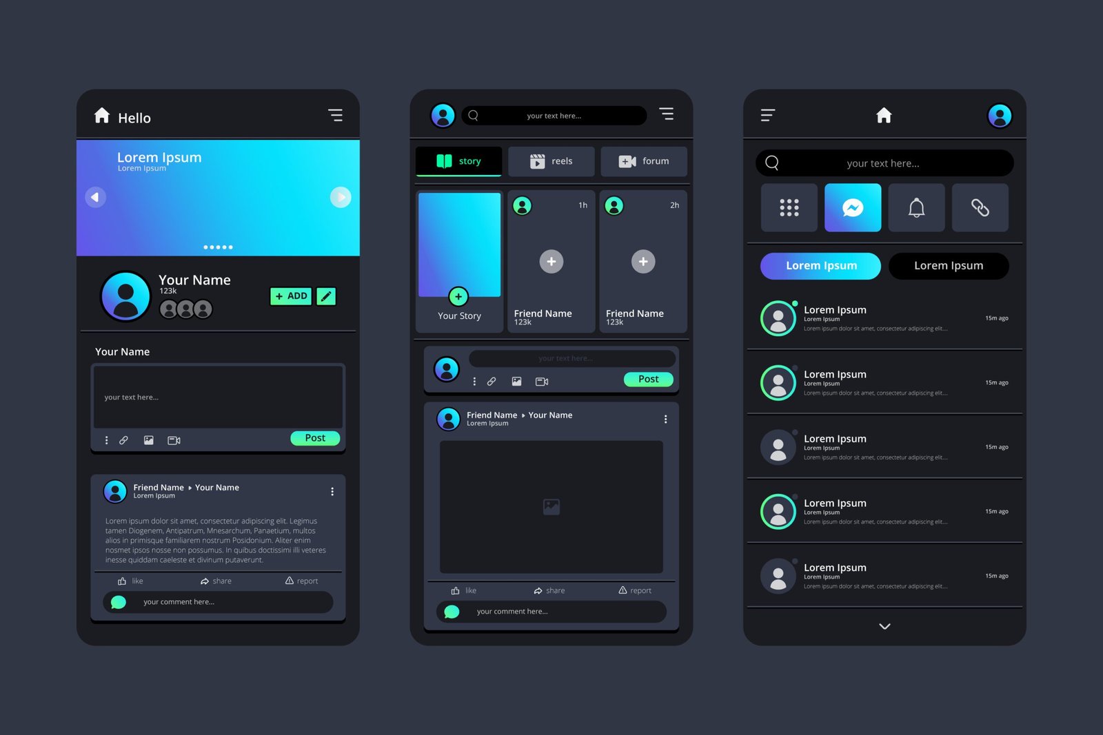
Images and illustrations designed for a light theme can look significantly jarring against a dark background. Therefore, for static images, choose separate dark mode versions. Apart from that, you can also apply subtle filters to desaturate the images slightly. On the other hand, for illustrations, you can use vectors that can adapt their colors dynamically. Sometimes, a subtle dark overlay can help integrate a light-themed image more seamlessly, in a dark mode design. So, keep on experimenting till you find the sweet spot!
In light themes, shadows are used to create depth. However, in dark mode, shadows become less effective. So, instead of that, use subtle highlights in background color or integrate a lighter-colored border to indicate elevation. Lighter surfaces appear “closer” to the user. For instance, a call-to-action button with a slightly highlighted border looks more visually appealing in the dark theme. This also respects dark mode design principles and helps maintain visual hierarchy.
When implementing elements like a dark mode button design, always make sure that their interactive states (hover, pressed, disabled) are distinct from each other. This enhances user experience substantially! Also, for hover effects, you can incorporate a slight color change or a subtle glow. Just remember that pressed states should provide a clear visual feedback. Disabled states need to be visibly inert, but still have to be clearly discernible from the enabled states. For interactive elements, clarity is indispensable. Because that prevents user confusion and improves overall usability in your dark theme.
As a developer, you must always respect the user’s system-wide dark mode preference. However, keeping that in mind, you should also be thoughtful enough to offer a manual switch within your application. Why? Because users might prefer dark mode for your app even if their system is in light mode, or vice versa. Hence, this manual approach provides flexibility and control. For dark mode in web design, a clear and easily accessible switch empowers users to personalize their experience and enhances user satisfaction.
When you are developing a dark mode mobile app, especially for devices with OLED screens, remember to use true black (#000000) for the primary background. What happens is, on OLED displays, black pixels consume zero power, which leads to significant battery savings.
On an overall basis, if you choose the best colors for dark mode, it can contribute significantly to the user experience. So, learn to avoid overly saturated or bright colors. Those can appear too bright and cause eye fatigue, especially when a user is operating the device or app in a dark environment. Instead, opt for desaturated, muted tones. These provide enough vibrancy to highlight elements without being too overwhelming to the eyes. Also, remember to test your chosen palette across various devices. This results in consistency and a great viewing experience.
Are you planning to design your own website? Here are some latest web design trends that can help you create an intuitive website design that your users will love to explore!
So, the journey to a truly effective dark mode design is much more than simply inverting color schemes. Rather, it’s a thoughtful approach that involves choosing the right shades and managing contrast for different screens.
Dark mode isn’t just a fleeting web design trend. It’s a powerful tool that helps enhance accessibility and fetches a myriad of benefits along with aesthetic brilliance. Hence, as a professional web designer or developer, these best practices can help make sure that dark themes are not only aesthetically pleasing but also genuinely user-centric and beneficial.
Are you passionate about trends in the technology landscape, and want to share some latest news or your expertise? You can send your blogs under our Write for Us technology category and help strengthen our tech community.
Dark mode design is a UI theme that presents content on a dark background and uses light-colored text and elements. It helps reduce eye strain and offers a brilliant aesthetic.
Designers should consider dark mode for the following reasons-
Yes, dark mode can be better for accessibility for many users as it reduces screen glare and contrast sensitivity issues for some with visual impairments. However, it’s crucial to ensure sufficient contrast and avoid pure black backgrounds or pure white text to prevent eye strain for others.
To choose the right colors, always avoid pure black and pure white. Opt for deep grays or dark blues for backgrounds and off-white or light gray for text. Also, be mindful of saturation levels, and you’re good to go.

As a tech-savvy Digital Marketing Specialist at Digital Concepts for the past five years, Sushmita Banerjee bridges the gap between complex tech and impactful storytelling. She channels her expertise into writing thought-provoking content covering everything from AI and software to the latest gadgets and breakthrough tech trends.
 Modern Website Architecture: The Secret Behind Fast, Scalable Websites
 Core Web Vitals 2026: How to Pass Google’s New Speed Test
 Best SaaS Collaboration Platforms for Remote Teams
 Passkeys vs Passwords: Are Passkeys Safer Than Passwords? (2026)
 Meta Edits app: Full Feature Guide, Updates, and now it is getting an AI assistant and a desktop version