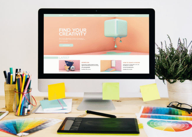
If you’ve spent even ten minutes scrolling through modern websites lately, chances are you’ve seen a bento grid layout without realizing it. From sleek SaaS landing pages to portfolio sites and ecommerce homepage designs, this layout style is everywhere right now, and for good reason.
The bento grid layout is popular because it solves a problem designers constantly face: how do you organize a lot of content without making the interface feel crowded?
The answer is structured with flexibility. Bento grids create organized layouts that still feel creative and modern. They help users scan information faster, make content blocks more engaging, and give websites a polished visual rhythm.
If you’re a designer, developer, or someone building a site for clients, understanding how bento layouts work can seriously improve your UI game.
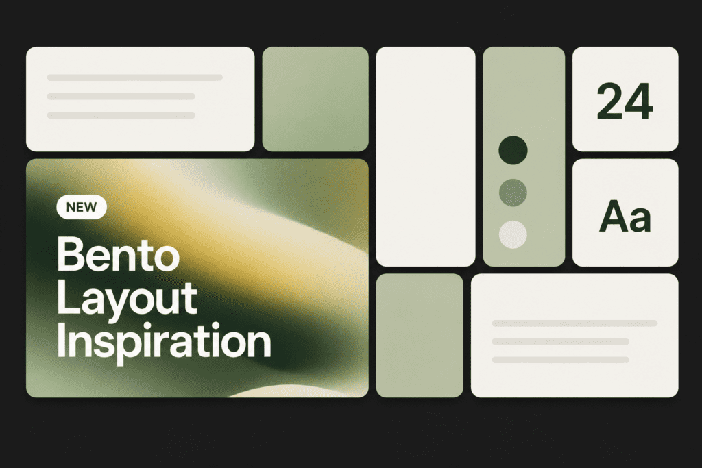
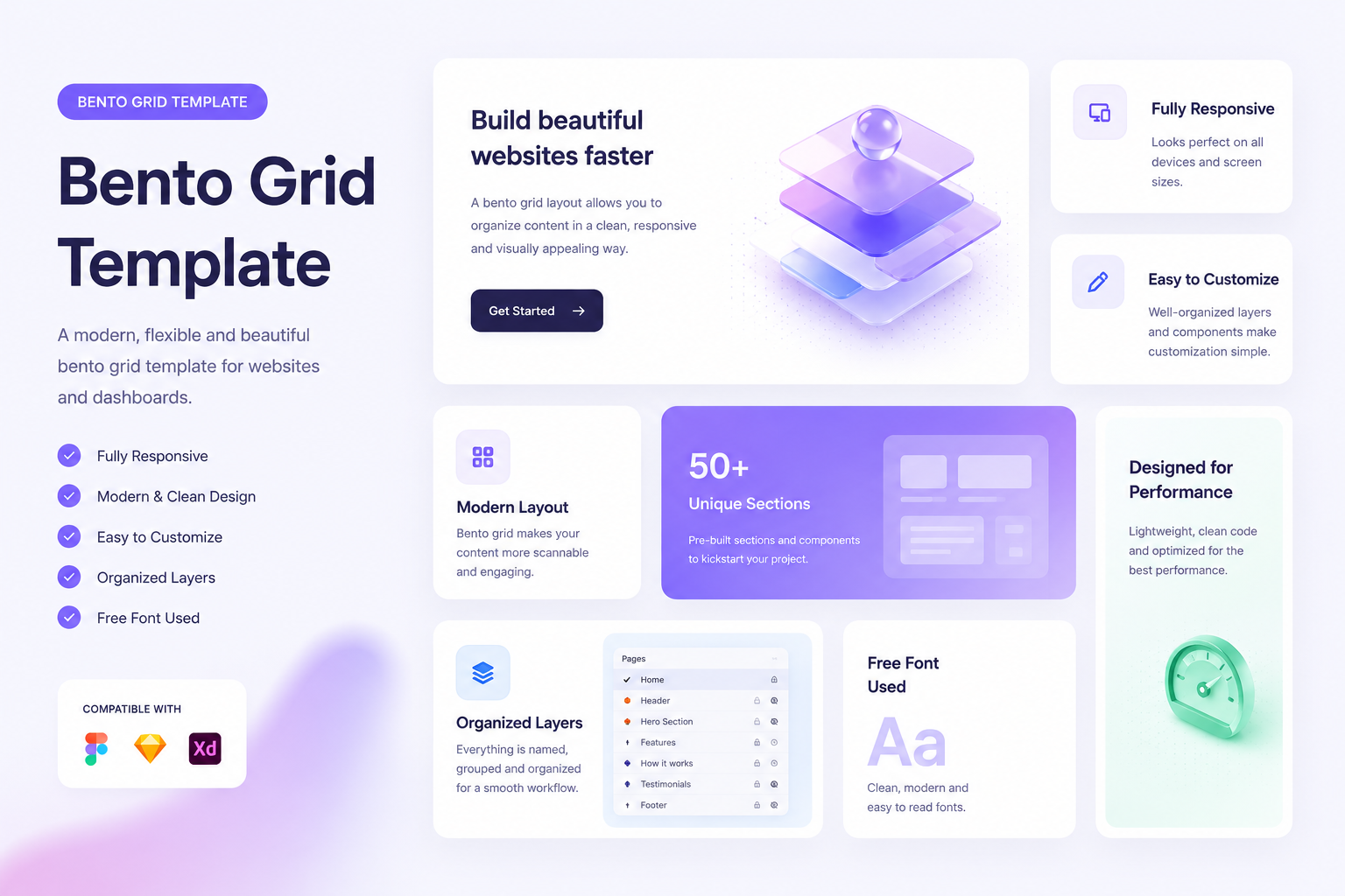
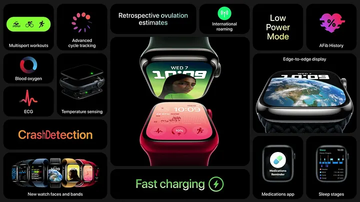
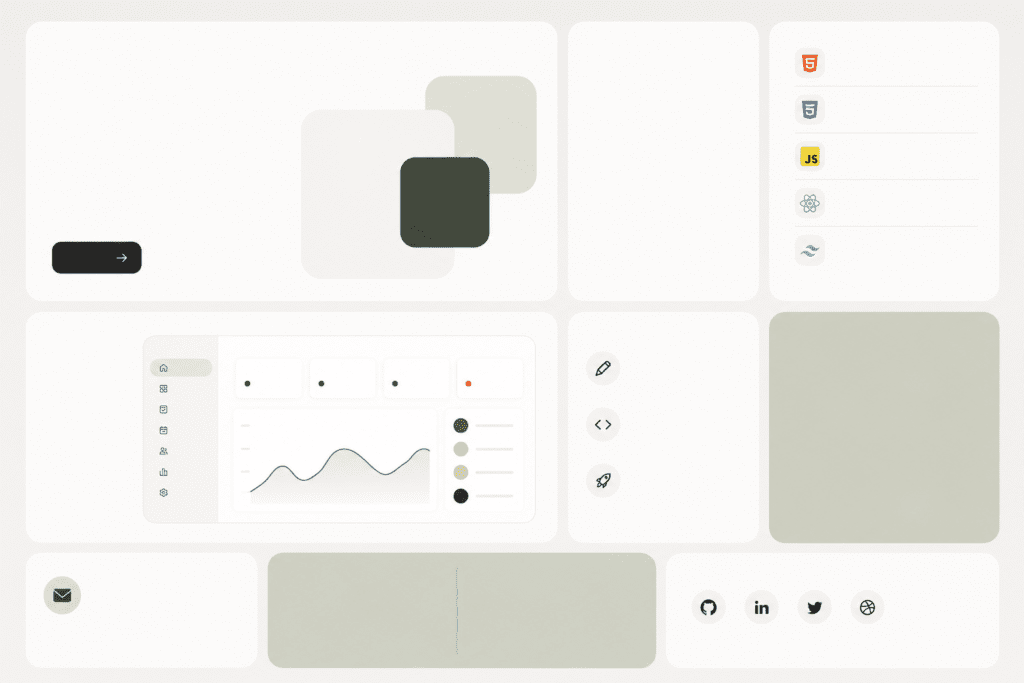
A bento grid layout is a UI structure made up of differently sized content blocks arranged inside a grid system. Think of it like a Japanese bento box—separate compartments neatly holding different items.
In UI design, those compartments can contain:
Instead of using identical cards stacked endlessly, bento layouts mix large and small sections to create hierarchy and visual movement. That’s what makes bento grid UI design feel modern. It guides attention naturally while still keeping everything clean and structured.
Minimalism dominated UI design for years. Then users began to expect more personality and better content organization.
That’s where Bento grids stepped in. They work especially well because they combine visual storytelling, strong hierarchy, mobile adaptability, better content scanning, and cleaner information grouping.
Major tech companies helped popularize the style, especially in dashboards and product showcases. Soon after, designers started applying Bento layouts to portfolios, landing pages, and ecommerce stores.
Today, the bento UI trend is heavily tied to modern product-focused interfaces because it balances creativity with usability. And unlike some design trends that look cool but hurt usability, Bento layouts are actually practical.
Not every uneven grid automatically becomes a good Bento layout. The best designs follow a few important principles.
The larger the card, the more important the information should be. Users should instantly understand where to look first. For example:
This is where many designers slip up.
Even though Bento grids feel playful, spacing should remain disciplined. Consistent padding, margins, and alignment create visual harmony. Without structure, the layout quickly turns chaotic.
A Bento layout already introduces movement through varying block sizes. You don’t need heavy gradients, shadows, and animations fighting for attention, too.
Simple UI elements usually work best.
A Bento grid can look amazing on a desktop and completely break on mobile if responsiveness isn’t planned properly. Good bento layouts adapt smoothly across devices.
Design mobile stacking behavior from the beginning:
The beauty of Bento layouts is their flexibility. Here are some ideal use cases.
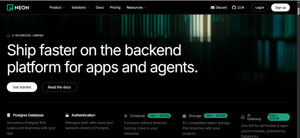
Feature showcases become much easier to scan when organized in Bento cards instead of long text sections.
You can highlight product capabilities, integrations, performance metrics, or customer reviews
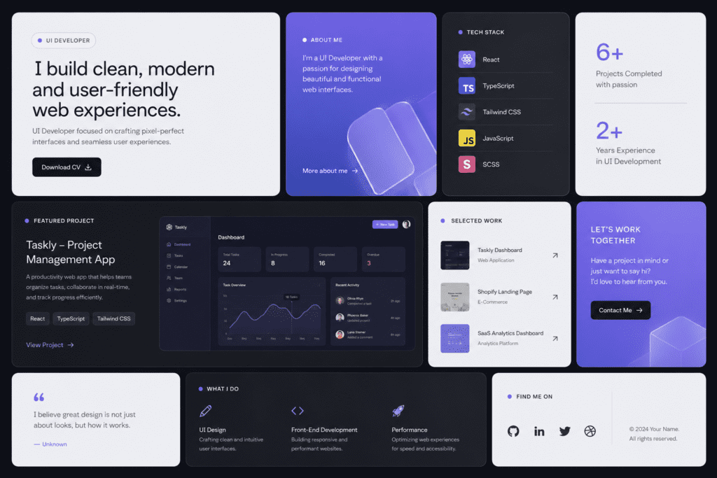
A personal website for UI developer projects becomes more engaging with mixed-content sections.
Instead of a boring project list, designers can combine:
This creates a more dynamic browsing experience.
Bento layouts are becoming increasingly common in custom website design ecommerce projects.
Why? That’s because ecommerce stores need to balance:
The structure helps users absorb information quickly without overwhelming them.
In fact, many of the best ecommerce website designs now use Bento-inspired layouts for homepage organization.
It also aligns nicely with current ecommerce website design trends focused on personalization and visual storytelling.
You don’t always have to build layouts manually from scratch. Several tools can speed up the process.
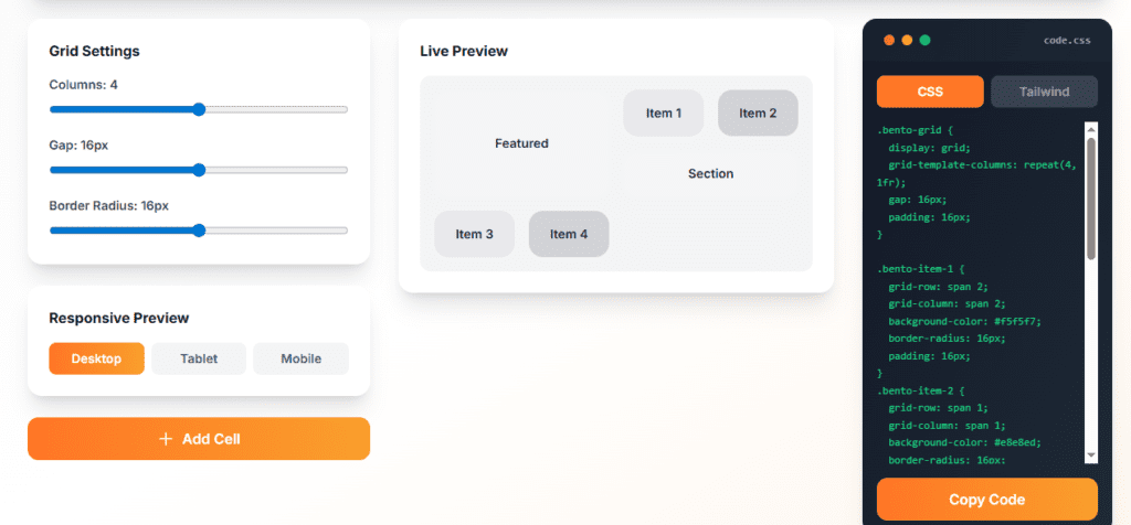
This helps developers quickly create responsive grid structures without manually writing complex CSS. These tools are useful for:
Most generators export clean CSS Grid code that you can customize further.
If you prefer designing layouts visually before development, a bento grid generator Illustrator workflow can help create structured mockups faster.
Many UI designers use Illustrator or Figma plugins to:
This speeds up collaboration between designers and developers.
Pre-built design templates can also help beginners understand Bento structure patterns.
Studying templates is useful because you learn:
Just don’t rely on templates forever. The goal is to understand the logic behind the layout.
Additionally, you can also use no-code app builders to create the bento grid. Framer, Webflow, and Elementor are the best platforms to do this.
The reason Bento grids became so popular isn’t just aesthetics. They solve real UI problems while making interfaces feel modern and organized.
A strong bento grid layout improves content hierarchy, enhances usability, and creates a more engaging browsing experience without sacrificing clarity.
Whether you’re building SaaS products, portfolios, or ecommerce experiences, learning how to use bento grid design effectively is becoming a valuable skill for modern UI/UX designers.
And the best part?
Bento layouts are flexible enough to evolve with your creativity. Once you understand the structure, you can adapt it to almost any interface style without making your design feel repetitive.
In a digital world full of endless scrolling and cluttered interfaces, that kind of clarity stands out. Share your thoughts on modular modern UI designs at Write For Us: Tech.
A Bento Grid is a web design layout that organizes content into neat, rectangular blocks of varying sizes, resembling the partitioned compartments of a Japanese bento box.
Bento Grids offer a clean, modular aesthetic that simplifies complex information. They create a clear visual hierarchy, adapt easily to mobile screens, and keep content organized and scannable.
Unlike uniform traditional grids, Bento Grids use asymmetric, rounded boxes to highlight specific features. They prioritize visual storytelling over strict columns, making layouts feel more organic and modern.
Most modern design tools like Figma, Framer, and Webflow excel at Bento Grids. Developers also use CSS Grid or Tailwind CSS to build these responsive, boxy layouts easily.
Yes. Bento Grids are inherently fluid and modular. They allow developers to easily stack, resize, or rearrange individual boxes, ensuring a seamless and organized experience across all screen sizes.

As a tech-savvy Digital Marketing Specialist at Digital Concepts for the past five years, Sushmita Banerjee bridges the gap between complex tech and impactful storytelling. She channels her expertise into writing thought-provoking content covering everything from AI and software to the latest gadgets and breakthrough tech trends.
 Core Web Vitals 2026: How to Pass Google’s New Speed Test
 Best SaaS Collaboration Platforms for Remote Teams
 Passkeys vs Passwords: Are Passkeys Safer Than Passwords? (2026)
 Meta Edits app: Full Feature Guide, Updates, and now it is getting an AI assistant and a desktop version
 How AI Is Changing Noise Cancellation Technology